

We love that Capital Style has asked us to contribute our expert tips to their Bride Blog! Today on the Capital Style's Bride Blog - Expert Tips we talked about selecting colors that work with your reception space.
Picking your color palette is one of the first and most difficult design decisions you’ll make when creating the overall design of your wedding. It’s important to make sure the color palette you’re thinking about using translates well into the space you’re using for the ceremony and particularly the reception.
I always advise my clients to pick a palette of five (5) yes, you read that right – 5 colors. This is necessary to create depth in the colors and décor. No one wants to see the same two colors used over and over again. Hello prom!
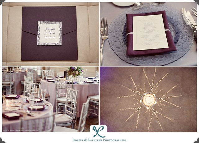
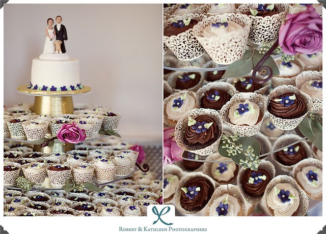
Below is an example of a well-designed room. The bride’s main color was purple but in this space, the color was lightened for the overall, bigger use of the space. The deeper purple that the bride originally liked is used in touches on the napkins, in some of the floral pieces, and on the cupcake display. Even the use of mixed metallics of gold and silver works so well in the room.
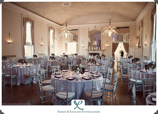
It was necessary to do this to make the color scheme make the most sense and look it’s best for the reception. As the evening went on, the lighting in the room became a more intense purple, but the transition was gradual.
Just beautiful!
Thank you Candice at Jubilee Events for letting me use this room as an example for this post. Photos are courtesy of Robert & Kathleen Photographers.


No comments:
Post a Comment